Most career tools handle either analytics, or applying, or market research reasonably well — rarely all three, and rarely with any sense of what to actually do next. CareerIQ set out to be the connected layer: one system that reads a resume, tracks an application, and tells you the next move, instead of just reporting a score and leaving you to figure out the rest.
6
2

This wasn't built on formal interviews — this is a pattern pulled from reviewing how people commonly describe friction with existing task tools.
GOALS
"Why does a good score come with no plan attached to it?"
"How do you make market data feel alive, not archived?"
"Can the same system hold up on a five-inch screen, not just a wide one?"

APPROACH
01
Coach the user, don't just score them
Turning the Overview into a checklist-driven coach meant losing some of the clean "dashboard" simplicity of a pure metrics view — but a score with no next step wasn't helping anyone act on it.
02
Say "upload," not "sync"
Correcting the import language across six screens meant publicly admitting a limitation — the tradeoff was giving up the impression of a live connection CareerIQ never actually had, in exchange for a product that doesn't overpromise.
03
One nav icon per screen, nothing else competing
Mobile navigation went through two rounds before landing here. Cutting the logo mark from nested screens cost a bit of brand presence in the header — in exchange for a user always knowing exactly where they are.
04
Lock desktop before starting mobile
Sequencing mobile after desktop was fully corrected meant a slower overall timeline — but avoided redesigning mobile screens against a desktop system that was still moving underneath them.
User flow

Career Growth

Smart Job Matching
Guided Apply walks every application through match analysis, resume optimization, and cover-letter generation, then a readiness check, before it lets you submit.


Profile Optimizer
Every "re-sync" action became an explicit upload. Every "last synced" timestamp became "last updated." Naukri was removed entirely — no legal path existed for it. Engagement stats are now labeled exactly as what they are: manually entered.
Job Market Radar
Live filters by location and time range, trending skills by growth percentage, and an AI forecast section — high-growth and declining roles, each with a confidence score.
Why this matters. Market data that only shows today's numbers goes stale the moment you read it. A forecast gives it a direction.

Full screen set
The feature walkthrough above covers the modules with the most to explain. These are the rest of the system — organized the same way the product's own sidebar groups them.
Full screen set

Resume Intelligence Hub
The ATS scoring and resume analysis behind the Overview's score.

Smart Job Matching
Curated matches that feed directly into Guided Apply.

Skill Gap Analyzer
Skill gaps mapped against target roles.
Track & analyze

Career Analytics
The broader performance and measurement view.
Detailed Profile Analysis
Section-by-section breakdown, keyword/ATS analysis, benchmarking.

Login
Split-screen entry point into the multi-step auth flow.
Account & settings
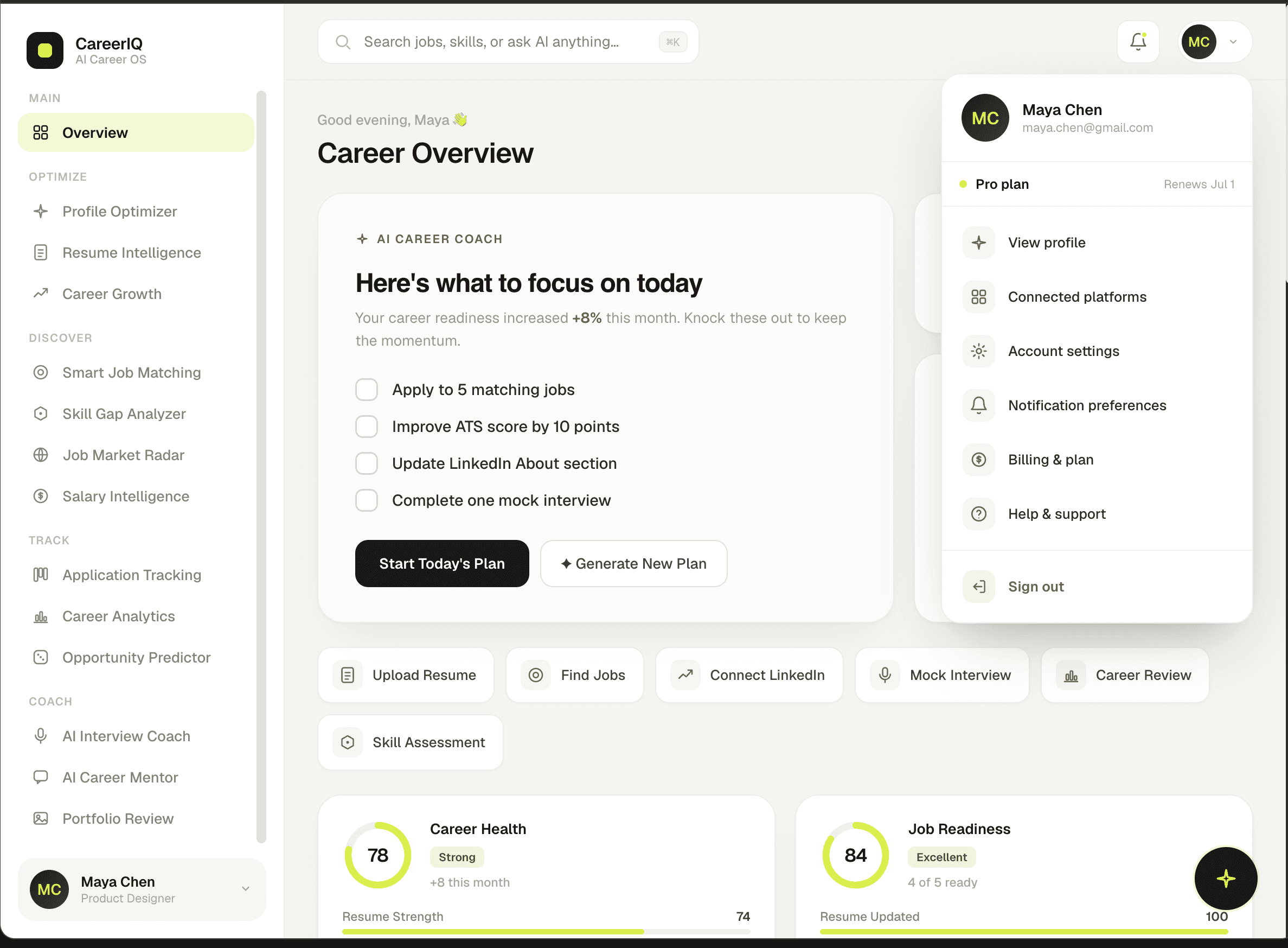
Profile menu
Entry point to Account, Billing, and Help.

Account Settings
Editable profile fields and 2FA.

Notification Preferences
Channel-by-channel toggles.

Billing & Plan
Three-tier pricing with upgrade actions.

Help & Support
Searchable FAQ.
Mobile — the same modules, translated

Profile menu

Profile Optimizer

Resume Hub

Skill Gap
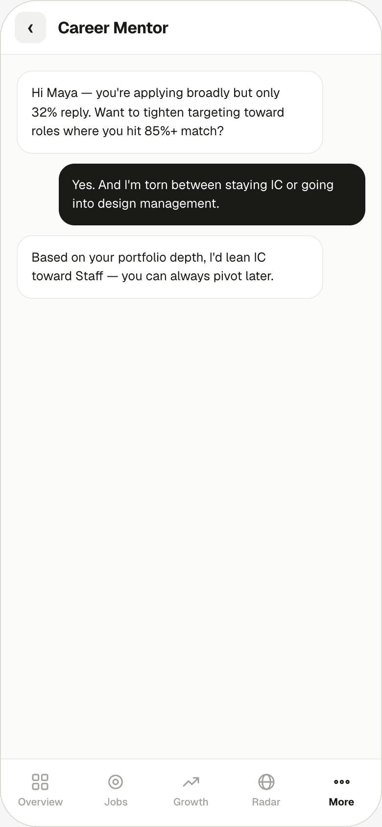
Career Mentor

Interview CoachMentor

Login — OTP

Guided Apply

Job Market Radar
the design system
Off-white backgrounds, floating white cards, generous radius, and a single accent used sparingly enough that it still means something when it shows up. Click a swatch to copy its hex.
Color
Paper
f6f6f3
Paper
f6f6f3
Surface
#ffffff
Ink
#1a1a17
Lime - Accent
#d4f000
Muted
#5a5a52
Succcess
#4f9d2e
Warning
#e0b84a
Danger
#912e2e
Border
#ececea
Typography
Aa Bb Cc
H2 / Section title — Geist, 28–42px, weight 700–800, tracking −0.025em.
Body text sits at 14–17px, weight 400, on Muted (#5a5a52) for anything that isn't a heading.
Body — Geist, 14–17px, weight 400, line-height 1.6–1.7.
CAPTION / LABEL / KICKER
Caption — Geist Mono, 10–12px, weight 600, uppercase, tracking +0.06–0.1em.
Outcome
What this round covered
As a personal project, ToDoza wasn't rolled out to real users — its value is in fully working through a connected system end to end.
16 modules connected under one coaching-first system, desktop and mobile.
8 corrections and fixes shipped this round, from import-language accuracy to mobile navigation clarity.
1 consistent design language — Geist, a single lime accent, and the green/amber/red status system — held across every screen on both platforms.
Reflections & Learnings
What this round taught
02
A logo in the corner isn't navigation. It took two passes on mobile to learn that clarity about "where am I" beats branding real estate in a header.
03
Sequencing avoided rework. Locking desktop before starting mobile meant mobile got built once, against a stable target, instead of twice.